
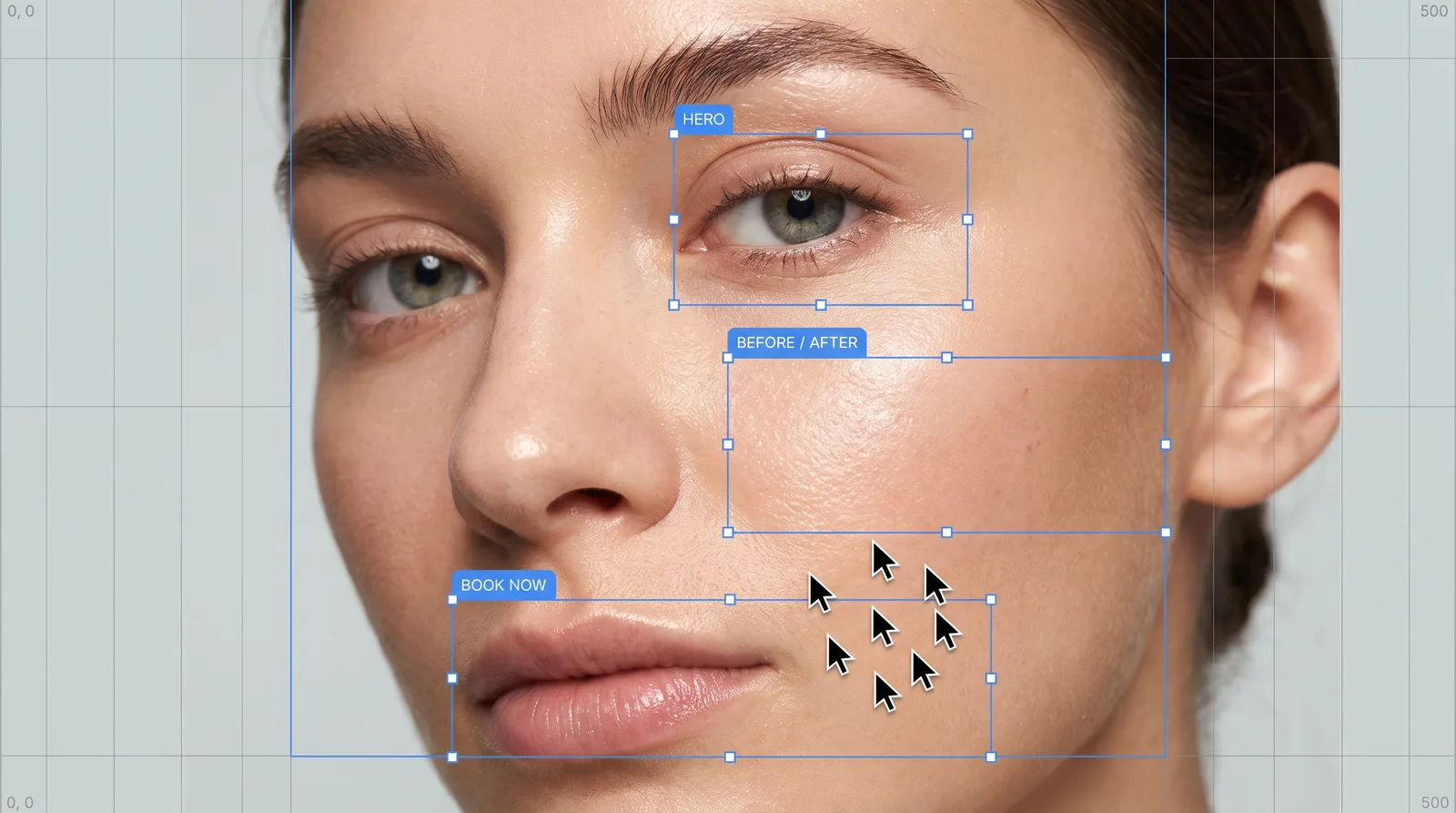
Most med spa websites are pretty. Far fewer are good at the one thing they're for: getting a stranger to book a consultation.
We design med spa and clinic websites at NTH Creative, and the difference between a site that looks nice and a site that books almost always comes down to the same handful of decisions. Here they are.
The 5-second test
Open your homepage on your phone and give it five seconds. A new visitor should be able to answer three questions:
- What is this place? (a med spa in your city)
- Why would I pick it? (your angle: natural results, a signature treatment, an expert injector)
- What do I do next? (book a consultation)
If any of those takes longer than five seconds, you're losing people before they scroll.
What every med spa homepage needs
A hero that sells an outcome. "Look rested, not done" says more than "Welcome to Luxe Aesthetics." Pair it with a real photo of your space or team — not stock.
One main button. "Book a consultation." Put it in the header, in the hero and after every major section. Don't make visitors hunt for it, and don't split their attention between five different buttons.
Your top treatments, visually. Three to six cards linking to dedicated treatment pages. Patients usually arrive with one treatment in mind; help them find it in one tap.
Proof. Reviews, before/afters where allowed, credentials, years of experience, number of treatments done. Trust is the whole game in aesthetics.
Your people. Patients are choosing who will touch their face. Show your injectors and providers with real photos and short bios.
Location and hours. Simple, near the bottom, with a map. Local patients check this before booking.
Treatment pages: where SEO and sales meet
Every core treatment deserves its own page — Botox, lip filler, laser hair removal, microneedling, and so on. Each page should cover:
- What it is and who it's for
- What to expect (time, comfort, downtime, results timeline)
- Pricing or a starting price, if you're comfortable sharing it
- FAQs patients actually ask
- Before/afters for that treatment
- The same "Book a consultation" button
These pages are also how you rank on Google for "lip filler in [city]." One generic "Services" page can't rank for ten treatments.
Design details that make a site feel premium
- Restraint. Fewer colors, more white space, one or two typefaces used consistently.
- Real photography. A half-day shoot of your space and team beats any stock library.
- Motion with purpose. Subtle reveals and smooth scrolling feel premium; autoplaying sliders feel dated.
- Consistency with Instagram. Patients usually see your grid first. When they land on your site, it should feel like the same brand.
Speed and mobile
Most med spa traffic comes from phones, often from an Instagram bio link. If the site takes more than a few seconds to load, people leave. Compress images, avoid heavy page builders where you can and test on a real phone, not just a desktop preview.
Booking: remove every extra step
Whatever booking system you use, the path from "I'm interested" to "I'm booked" should be as short as possible. Link straight to the booking page for that treatment, keep forms short and confirm instantly. Every extra step loses people.
Quick checklist
- Outcome-focused headline above the fold
- One clear "Book a consultation" button, repeated
- Dedicated page for each core treatment
- Real photos of your team and space
- Reviews and results visible on the homepage
- Loads fast on a phone
- Matches your Instagram look
- Booking in as few taps as possible
If you'd like a site built around this from day one — designed to look premium and to book — see our med spa website design service.